
What Is Image Quality, Really?
Understanding 3D pop, micro contrast, motion cadence, MTF curves, sharpness, bokeh, organic, dimensionality, chromostereopsis, subjective viewing conditions, SQF.
By Marko Li
This article is optimized for viewing on 16” monitors.
-
1. Chapters
2. Introduction
3. Abstract
4. Shadows
5. Color
6. Is Image Quality Real?
7. Contrast
8. MTF Curves
9. Sharpness
10. Micro Contrast
11. Dimensionality
12. Immersion
13. 3D Pop
14. Three-Dimensional Characteristics
15. Subjective Viewing Conditions
16. Bokeh
17. Motion Cadence
18. Organic
19. Final Remarks
20. Errors and Uncertainties
21. References
Introduction
If you ask 20 filmmakers what the term ‘organic’ means, you’ll likely get 20 different answers. If you ask 20 people what ‘cinematic’ means, you’ll probably get 25. Cinematic used to mean images resembling cinema, but with streaming services and commercial influence, what movies look like has been constantly changing. Since I’m probably a bigger image quality snob than most, I thought I’d use a critical thinking approach to share my perspective on what it all means in a demonstrable way that general audiences and skeptics alike can understand. However, it's important to understand that simplification is necessary in order to make it digestible and clear, but one has to then put up with the fact that the precision of the description suffers. To understand the realities of image quality, one should first have a grasp of human perception or its application is irrelevant. This is no different than the understanding of color management, gamma shift and displays to accurately represent the original intended color grade. Without further ado, let’s begin!
“Simplification is necessary in order to make it digestible and clear, but one has then to put up with the fact that the precision of the description suffers.”
Abstract
The perception of image quality is more than the sum of its technical metrics and I attempt to illustrate it with real world examples and optical illusions to demonstrate the 3D perception of 2D images.
Shadows
Akiyoshi Kitaoka
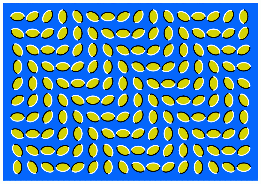
Let’s begin by inspecting this image from Akiyoshi Kitaoka. Which image has a darker face? What if I told you each face has the exact same luminance? If you were to place a light meter on the faces or make the images overlap, you’d find that they are the exact same shade. This optical illusion illustrates that basic perception is heavily based on the surrounding context. There are many other famous optical illusions manipulating shading and contrast and its correlation to dimensionality should be clear. If you’ve ever tried to draw something 3D or played with CSS box/drop shadows, you’d know the effectiveness of a simple shadow in creating a 3D image. Shadow are a basic way for our minds to interpret something as having depth and is the core element of contrast ratio. (These images are downloadable with less compression for you to compare for yourself so you can be sure that I have not tampered with them)

Shadows make this tattoo look dimensional (the shine on the fish and defined edges also help)
Color

Is the dress black and blue or yellow and gold?
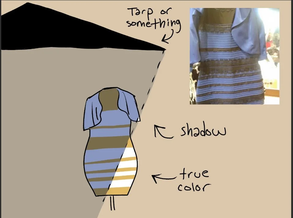

As hues can have varying levels of luminance, color ratio also has the potential to enhance dimensionality. Color is an even more subjective trait that varies person to person. A well known example is the image titled, “What color is the dress?”, which has gone viral for appearing both black and blue as well as white and gold. Surely an ordinary dress doesn’t change color? But based on shading and context, we see different answers among the population.

Is turquoise green? https://ismy.blue/
Turquoise is a particularly subjective color with some people perceiving it as more green or blue. I perceive it as green and you can actually test your turquoise perception at https://ismy.blue. Gavin Evans provides another possible explanation for this through linguistic determinism, arguing that colors are determined by language. Evans cites there are cultures like the Ancient Greeks and Himba tribe in Namibia that do not have a word for the color blue and therefore have trouble distinguishing it from green. But because they have more vocabulary for the different shades of green, they can differentiate subtle green variants more precisely.
Akiyoshi Kitaoka - “The End of the Earth” - https://www.ritsumei.ac.jp/~akitaoka/scolor-e.html
Not all human eyes are as perfect as they seem. One such phenomenon is called chromostereopsis, which causes a binocular disparity in depth due to differences in color, particularly red and blue. This illusion from Kitaoka should appear to float off the screen with the majority of people experiencing red closer than blue and the minority perceiving blue closer than red (I perceive blue closer). The rest should see both red and blue on the same depth plane. This depth in color is a result of longitudinal chromatic aberration in our eyes suggesting that this visual conflict could be a result of blue and red being different wavelengths. Because red is a shorter wavelength, some perceive it as closer. If you’ve ever played with tungsten light or red/orange CTO gels you might also notice an effect on the image, most notably improving lowlight performance on the Red Komodo. This is also how some low-light optical low pass filters work, through allowing certain wavelengths of light to pass more easily.
Akiyoshi Kitaoka - https://www.psy.ritsumei.ac.jp/akitaoka/scolor3e.html
Akiyoshi Kitaoka - https://www.ritsumei.ac.jp/~akitaoka/index-e.html
I perceive blue closer than red
As this is a binocular effect, if you close one eye the effect disappears. The effect is strongest when the images are presented on a black background, but when the background is white the perceived depth order is reversed and weaker. This, at least to me, strongly explains why black bars cropping an image to a 2.39:1 aspect ratio feels more cinematic and I daresay dimensional by enhancing the sense of depth. Even more interestingly, the effect is stronger when viewed at different distances, but I’ll let you interpret these ramifications yourself.
Black background. This illusion I rendered works the strongest on me.
16:9 - taller aspect ratios are more realistic to our vision
Exact same image on white background. Barely works on me.
2.39:1 - black bars/vignette/darker backgrounds function similarly to squinting your eyes, which can help you focus more clearly by reducing the amount of light to your vision and hence increasing contrast, i.e. tunnel vision.
We also have a population with mixed color deficiencies. I am red-green color blind and I interpret color and hence images differently than others would. In the examples below, you should be shocked to realize that all the hues are the same. The reason the brightness of the blocks appears different is a result of their contrast with the surrounding context.

https://www.youtube.com/watch?v=zsspPVCARZM&t=12s
The following illusions created by Akiyoshi Kitaoka illustrate the profound subjectively of color in perception. These are nearly impossible to believe so I welcome you to zoom in or download the images for yourself to compare side by side.
What color are the lines in the overlap of the circles?
- They’re not white. Zoom in and see for yourself.


What’s your favorite color coke can?
- Actually they are all made with just white lines. That can is not red, it’s white.
What color is the eye?
- It’s not yellow, these two eyes are the same shade of grey.
What color are the strawberries?
- It’s not blue.
Okay, so optical illusions are a pretty cool magic trick, but what does that have to do with real world image quality? These controlled illusions are more relevant than you think and are not just limited to blocks and rare esoteric examples. QOVES Studio illustrates this phenomenon in how we perceive human skin color. In the images below, which model do you think has darker skin? Even if you don’t subscribe to the notion of implicit bias, you might find yourself on first glance finding the model on the left to have darker skin as a result of contrast or socio-cultural biases.


https://www.youtube.com/watch?v=30XXbjFX61Q&list=LL&index=11&ab_channel=QOVESStudio
These images aren’t presented to argue for implicit racism, but rather the many factors that affect our perception. The only thing I’m trying to convince you of is that color, brightness and contrast are immensely subjective. Yet it's these 3 attributes that affect the dimensionality of an image the most, which brings me to my hypothesis that some of scientific comparisons online disproving this and that, might not carry as much relevance in practice.
Is Image Quality Real?
This segues into a controversial debate in the filmmaking community and one of the main questions I’m investigating: “Is 3D pop real?” First of all, this question is phrased so poorly I don’t even know how to begin to address it. What does “real” even mean? Are images played at 24 frames per second actually moving? Is there really a man in the television? Does Harry Potter really fly on a broomstick? Are the aliens in Alien real? From the optical illusions I’ve presented, hopefully I’ve demonstrated that how we perceive contrast and dimensionality is more inconsistent than can be scientifically measured. Image quality can similarly be an illusion with many aspects unable to be calculated with complete precision. But I will at least try.
Contrast
Before we get into deeper image analysis, we need to first define basic terms to be on the same page. If you already know how to read an MTF curve, feel free to skip to the micro contrast section.

In optics, contrast refers to the difference between bright and dark in an image. In laboratory settings, it is measured by how clearly our imaging systems can capture line pairs or cycles per millimeter abbreviated as Lp/mm and c/mm. The more line pairs that can be reproduced, the more perceivable contrast the camera and lens allow us to see. With perfect contrast, you would be able to distinguish every minuscule line pair perfectly, equating to a perfectly defined image. With 0 contrast there would be no lines and hence no image. This is what MTF curves describe, which is one of our best tools in measuring image fidelity despite its limitations.
Thicker lines more obvious to our vision (low spatial frequencies)
MTF Curves
If you want a deeper dive into how to read MTF curves, I highly recommend reading Hubert Nasse’s 33 page article, which goes much deeper. My analysis mainly attempts to expand upon it for cinematography. Zeiss, Canon and Nikon vary slightly when measuring MTF, which is also influenced by many variables including the camera sensor, lens, lighting, distance and lab situations. That’s why each MTF recording is usually based on an average. They all attempt to measure the same thing: contrast, sharpness and corner performance. This modulation transfer function is essentially a graph where the Y axis is contrast (modulation) as a function of Lp/mm and the X axis is image height. In plain English, it measures contrast performance at different distances from the center. I will initially simplify Lp/mm to resolution because we normally associate the ability to magnify details like more line pairs as a sensor and lens having higher resolving capabilities. Lenses naturally perform worse in the corners, which is why the contrast in MTF curves decreases as you move toward the right, signifying the edges of a lens. All lens design is compromise, so it is physically impossible to have a perfect lens with perfect contrast at all corners of an image. There are also other tangential and sagittal lines recorded as not all line pairs are captured equally, but let’s keep things simple.


So what does this graph equate to in real life? More contrast per resolution is just how detailed the image is. If we have more contrast per line pair, this means our eyes can more effortless identify finer details, giving us the impression of more texture, clarity and edge definition. Wait a minute, isn’t that just sharpness?
Sharpness
Acutance, sharpness and edge definition all attempt to describe the same thing, though acutance is the scientific term. As contrast improves, perceived detail and edge definition increases as well. Does that mean sharpness and contrast are the same thing? Yes and no. It makes sense that as the contrast of these four squares improves, the perceived sharpness increases as well. Meaning, higher contrast at these pixel levels yields more edge definition and perceived sharpness. But the reason why multiple terms exist is to allow us to be more precise. A square is a rectangle, but a rectangle is not a square.


For example, if you artificially sharpen an image by making the bright side of an edge brighter and the dark side darker, this can perceivable improve sharpness without actually increasing any resolution of detail. This means that edge definition and resolution are not the same. Sharpness is a term correlated with perception. You can also visualize this by adjusting the contrast and sharpness sliders in your NLE. These two controls alter the image but in perceivably different ways - one makes the image have more defined edges and one makes the image darker and highlights brighter on a macro level. And that is how one of the most controversial phrases in photography came to be: micro contrast.


Micro Contrast
Strong contrast, lower resolution
Low contrast, higher resolution
Hopefully by now we can start to distinguish the differences between contrast, sharpness and resolution. Perceived sharpness is affected by the other two. You can have a filmic image with low resolution yet high contrast. You can also have an image with high resolution and low contrast. The image you think looks sharper, let alone better, will be subjective, and why adding overall contrast to an image in post can also give the impression that an image is sharper.
Contrast increases the perception of sharpness
That’s why Hubert Nasse uses the term micro contrast to specify which kind of sharpness. We can imagine what increased global contrast does in Davinci Resolve or Lightroom, but when looking at MTF curves we’re inspecting the contrast of pixels and microns. Nasse uses micro contrast to differentiate itself with edge definition and general acutance. In his How to Read MTF Curves article for Zeiss, he describes the performance of a lens at f1.4 seen in the graph below. For Zeiss MTFs, the top curve represents thicker 10 Lp/mm lines indicative of overall global contrast. 20 Lp/mm curve is in the middle and then 40 Lp/mm at the bottom. Notice how he uses the term micro contrast to describe the performance of the bottom curve.


Lloyd Chambers on Zeiss lenses. https://lenspire.zeiss.com/photo/en/article/micro-contrast-and-the-zeiss-pop-by-lloyd-chambers
The arrow at the bottom reveals that he uses ‘micro contrast’ when referring to the contrast performance around the micro 40 Lp/mm levels. Lloyd Chambers also affirms this in Zeiss Lenspire articles. This should be pretty intuitive now - micro contrast refers to the amount of contrast at micro line pairs.
Here’s a rock with strong micro contrast.


Here’s another Rock with strong micro contrast.
It’s not a term, it’s two words. He simply uses the phrase to distinguish local contrast from edge definition, because strong global contrast does not always guarantee proportionally equivalent micro contrast. Although in this case he specifies 40 Lp/mm, it’s suggested from his article that he uses it loosely when describing high Lp/mm performance on MTF charts. One could then consider this range or amount of local contrast arbitrary, until we see lower resolution cinema cameras with higher sharpness in practice. Unfortunately, sometimes being too specific can regrettably cause more confusion in the end.
Zeiss Otus 55mm f1.4 @f1.4 on 26MP Fujifilm XH2s
300% zoomed in
I don’t think this deserves to be that controversial. For open-minded listeners, it simply boils down to contrast for fine details, which is still basically sharpness but on the relative local level since sharpness also applies to edge definition. If you are still having trouble visualizing it, global contrast is largely in relation to edge definition and micro contrast relates to textures like freckles or pores on the face. And this detail is what makes an image feel tactile through a tangible tonality, giving it bite. I think crispness would be a better descriptor, but we already have enough buzzwords to deal with. You can get the gist of it when increasing the texture pop effect in Davinci Resolve, which seems to increase localized contrast for a specific range of spatial frequencies.


Another way to interpret this is with a different MTF curve called the Heynacher Integral. It’s quite similar to the first MTF curve except we now have varying ratios of MTF on the Y axis and Lp/mm on the X axis instead of distance from the center (image height). The image below illustrates this and the line pairs more clearly. As the Lp/mm increases, they become thinner meaning imaging systems will resolve contrast and details less clearly. These higher spatial frequency lines are less obvious to our vision and more susceptible to noise and grain. Humans are naturally more sensitive to low and medium spatial frequencies, in other words, bigger details. So the area under the Heynacher curve measures the bulk of perceived sharpness, as opposed to resolution.
These integrals can hypothetically describe an optical system with high resolution while having less perceived sharpness to the human eye. Comprehension check: which image would look sharper?


From the graph, we can see that a left Heynacher Integral extends up to 40 Lp/mm, marking a high resolution yet low total perceived sharpness. A right Heynacher Integral only extends up to 20 Lp/mm marking a lower resolution, but the area of MTF is higher meaning the overall image should appear sharper because our eyes are more sensitive toward larger details.
Fujifilm XH2s
Very defined edge definition
This perceived sharpness is what most mirrorless cameras attempt to capture through resolution. The “digital look” can be characterized by strong edge definition yet a lack of relative micro contrast at those frequencies. The high edge sharpness of digital cameras could still be more appealing to the untrained eye because sharpness can be shallowly interpreted as a sign of quality. It’s certainly useful for zooming in, but that’s not how most pictures are intended to be presented. By ignoring the overall balance of contrast particularly at the tail end of spatial frequencies a system can resolve, an image’s realism can suffer as a result of not having as much fine detail, even if we are less sensitive to them. Resolution is not everything and you should mainly only consider its relevance for cropping or blowing images up on massive theatre projections.
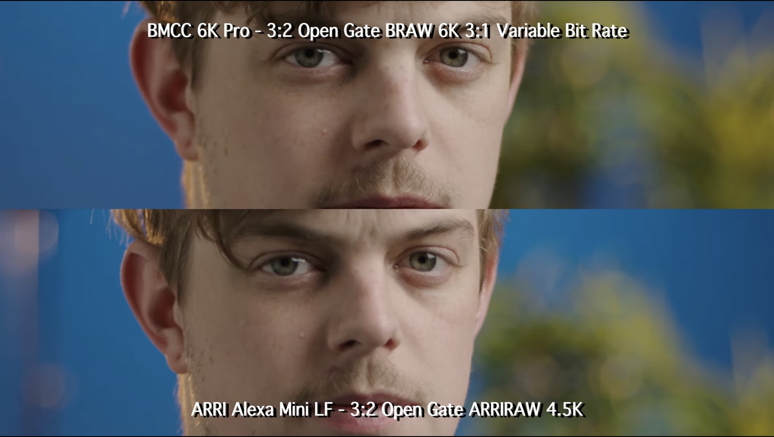
Northwest Camera Co. - https://www.youtube.com/watch?v=1Rtmu6wlIGU&t=157s&ab_channel=NorthwestCameraCo.
4.5k Arri has noticeably lower sharpness when zoomed in with the eyes and mustache less defined.

Normal viewing try to notice Arri’s superior tonality in the shadows and wrinkles particularly on the nose and bags. At this distance you should notice the lower sharpness of hair, but the micro contrast relative to the over contrast might even make the mustache more defined here.
Blackmagic Design cameras supposedly have high resolutions capable of 6k, 12k and now even 17k. And yet, when you compare them with lower resolution cinema cameras like the 4.5k Arri, they have worse MTF performance and even noticeably less perceived sharpness. According to Pawel Achtel, the Alexa LF is about 60% sharper delivering almost twice as much detail as the Ursa 12k. More resolution doesn’t guarantee sharpness. Resolution only translates to more texture when there’s enough contrast at those frequencies.
Pawel Achtel
https://vimeo.com/528541990
Liam Nielsenshultz - https://www.youtube.com/watch?v=KfbIt05sNxA&ab_channel=LiamNielsenshultz
https://8kassociation.com/industry-info/8k-news/a-12k-sensor-isnt-necessarily-a-12k-camera/
https://8kassociation.com/industry-info/8k-news/a-12k-sensor-isnt-necessarily-a-12k-camera/
You may even notice something similar on a 6k BMCC6kFF versus a 4k Sigma FP. The Blackmagic looks clearly sharper zoomed in and has more edge definition, but the FP has more contrast and tonality straight out of camera. You’ll have to add more global contrast on Blackmagic (about 1.2 in the contrast slider) in order to get a comparable image. From the shading and freckles around the nose, there is still a tonal difference resulting from the fact that micro contrast doesn’t scale as proportionally with global contrast often leaving texture and shadow tonality behind. The fact that mirrorless cameras already have strong edge definition further imposes a ceiling when adding natural amounts of contrast, unless maybe you have industry expertise with some contrast workflow that I don’t know about. Why does this matter? Because when dialing in contrast for any color grade, the breaking point for over-cranked contrast is typically gauged at the fine details. This is why I generally prefer the images from the Sigma FP for its high contrast yet softer image. That being said, there are times when the Blackmagic looks better with its sharpness. With other cinema cameras like Red and Arri, their strong OLPF makes the image softer while also maintaining micro contrast.
Regarding Blackmagic footage, their engineers seem to have a similar playbook for all of their sensor designs. Their balance of OLPF doesn’t always sit right with me and typically makes Blackmagic footage look artificially sharpened. The trailing micro contrast in juxtaposition with the high edge definition can make it appear as if it had been first de-noised. If you’re familiar with the effect of blurring then unsharp mask, you might notice a comparable faux sharpness. The most obvious indicator of this that I always look for is whether the hair looks sharper than the texture of the face. Of course if you have a filmic style of grading with less contrast, none of this may pertain to you.
Blackmagic Design - URSA 17k 3x crop
2x crop
blur unsharp mask - notice the hump in sharpness
This is not to say camera image quality is not close these days, I’m just honing in on the minute differences in practice , which only matter when you really care about the picture. For the average observer, a Sony mirrorless might look just as good if not better than an Arri cinema camera simply due to edge definition. In these examples, you may first decide Cam B looks the weakest because of the softness resulting from the grade. Despite less saturation and macro contrast, there’s actually richer micro contrast in the pores, beard and fabrics that make the images look more true to life. Cam B will require relatively less global contrast and final sharpness for a proper grade. Meanwhile the other high contrast footage here could even use some gaussian blur to dither its sharpness. I don’t think these other cameras have better detail, they just have heavier-handed Rec709 conversions. Contrast ratio can certainly be part of a camera’s imaging pipeline, though some mirrorless cameras over-compensate attributing to a less natural, more digital look. Bear in mind, there’s also considerable variance in these tests. Thank you to Tom Antos, Daniel Gall and Linus for these comparisons. Please check out the links to their original sources in order to see more clearly.
Cam B is Arri, Cam C is Sony. (Your perception of which one is better changes depending on whether it is viewed full screen)
Left is Sony, Right is Arri. (Your perception of which one is better changes depending on whether it is viewed full screen)
Daniel Gall - https://www.youtube.com/watch?v=jmCphrrvWWA
Left is Blackmagic, Right is Red. (Your perception of which one is better changes depending on whether it is viewed full screen)
Although I’m focusing heavily on micro contrast, it’s not the holy grail for desirable aspects in an image. Sometimes it may not even look good. Currently most YouTubers avoid sharpness in favor of softer imagery. Strong micro contrast sounds great but not when it makes your edge definition overly sharp. It’s about balance. If you think this is all wine tasting then sure, buy the cheapest bottle of imaging for yourself. But just because the audience can’t distinguish what a cheap versus finely tuned instrument sounds like, doesn’t mean it doesn’t matter to the musicians.
Dimensionality
People sometimes confuse dimensionality with shallow depth of field, but if that’s true then how can images look dimensional at f8? The reason so much effort was made to define micro contrast is because this is largely what makes an image look convincing. Reality has unlimitedly fine details, the foundation of what makes images tactile, vivid and life-like. Rich shadows, brilliant specular highlights and texture are what give objects a biting realism. This is how artists are able to make a 2D drawing look dimensional because the more detail and tonality something has, the more realistic it looks.
Slim Draw - https://www.youtube.com/shorts/7GIWMhVR0vA
Gurekbal Singh Bhachu - https://www.youtube.com/watch?v=TvbY4zCF_gg&ab_channel=GurekbalSinghBhachu
Illusion illustrating the effectiveness of specular highlights in creating glossy dimensionality
Video differs from photography in that it requires the illusion of motion to tell a story. That’s why cinematographers might pursue a 3D look so audiences can more comfortably immerse themselves for a 3 hour feature. But how do you accomplish making 3D images when they are presented on a 2 dimensional screen? What even is dimensionality?
Can you tell which bowls are closer/farther?
Brilliance of highlight tonality also plays a role in dimensionality
Dimensionality is essentially the qualities that allow an object to resemble real life. We’ve covered the importance of micro contrast, but it is not the only factor. It should be effortless to discern how close or far away objects are in relation to the foreground, middle and background. This is why half the tests online are poorly conducted as they only present a subject or chart with no focal planes. If you want to test spatial depth you would ideally create a scene with actual dimensionality or the only reference we can base it on is the shading on someone’s nose.


Are you able to gauge spatial distance effortlessly? Is it easier to see which trees are closer and farther for a certain camera? (This is also affected by the color separation in this example)
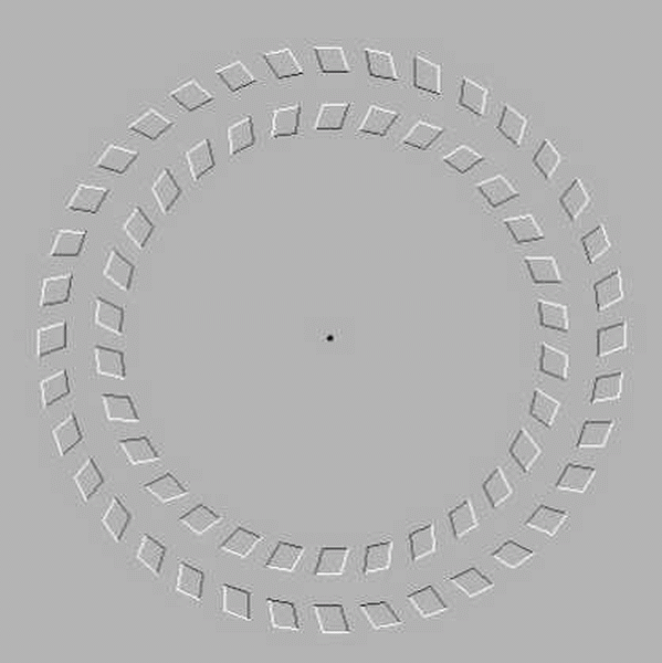
If you still have trouble perceiving spatial depth, don’t worry, it’s not necessarily a bad thing. An unfortunate truth when dealing with images is that our cognition is not always reliable and can have trouble interpreting images as is the case with optical illusions.
These optical illusions illustrate how our we perceive size.

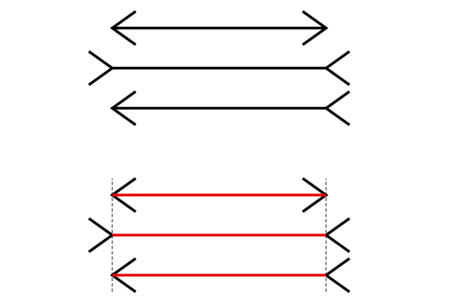
These illusions illustrate the subjectivity of straight lines.
These illusions illustrate our inadequacies gauging length.

And these illusions illustrate how our perception of depth is relative.
https://www.youtube.com/watch?v=iuIT5wc-7AQ&ab_channel=SLUMS
https://www.youtube.com/watch?v=cIO_UAh-PJM&ab_channel=HowardLee
Dimensionality of an object may not actually be real, but does that even matter when we can’t tell the difference?
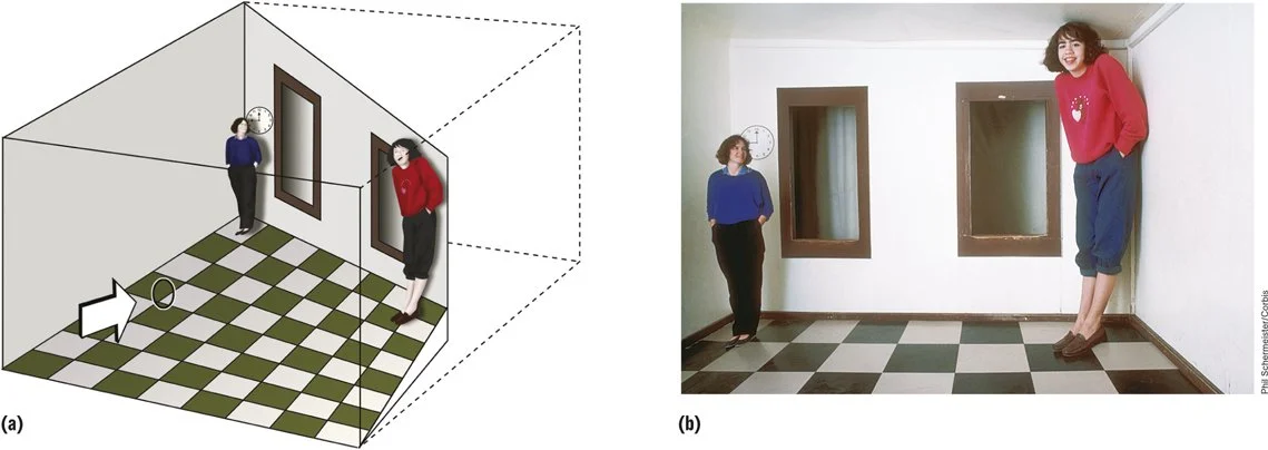
One of these squares in isolation does look not look dimensional, but in relationship to the others, they appear to bulge. With moving pictures there’s even more context, which is ultimately what dimensionality predicates on. Just because something isn’t actually three-dimensional, doesn’t mean it can’t look three-dimensional. What gives something the illusion of depth is not only limited to contrast, shading and context. Depth perception is relative. And if these illusions reveal that our perception is subjective, then so is image quality.
“That’s why no set of scientific measurements can ever be a proper substitute for the visual impression of a photograph taken under realistic conditions.”
Immersion

Immersion is simply a feeling used to describe images when the realism is convincing enough to feel agreeable to human perception. It’s an indicator of how well something emulates the natural perception of human experience. Basically, nothing should be a distraction or disconnect from the story you are telling.
These images were taken with the GFX 100s ii and a 45-100mm zoom lens. Fujifilm has historically prioritized sharpness and contrast for their optical design and you can certainly see it here with these 100mp jpegs (There is a 20MB limit so these will be compressed). All the detail you could want is for cropping is there and the contrast is indeed strong. But to my eye something immediately feels aesthetically unpleasant. The GF lens is sharp like any Zeiss image, but the edges are so defined to the point where the subject feels like a cut-out. You can also notice that the bokeh behavior is different. The way the bokeh transition goes from in-focus to-out-of focus when rendering different planes of tree branches creates an unnatural separation. (Also this is more to do with the lens than the sensor)


These original jpegs are too large so I’ve only screenshotted them here. They are available to download on my Google Drive.
Zeiss Otus 28mm f1.4
The area around the edges have a certain rolled-off roundness to them that makes the edge definition appear less jarring and more natural
There is certainly a thing as too much contrast and sharpness, but there’s more to it. Here’s a photo with the Zeiss Otus with deep aperture. Strong contrast, but not as much perceived edge definition as you’d imagine for such a “clinically sharp lens”. If sharpness of detail isn’t the key, it must be a balance of features.
Fujifilm 23mm LM f1.4
Zeiss Otus 28mm f1.4
Zeiss lenses are often lauded for having impeccable micro contrast, but there are lenses from Sigma, Fujifilm and Sony that have just as much sharpness while somehow not looking as dimensional. On first glance, the common observer will likely find the Fujifilm on the left to look superior especially because of the overall edge definition/contrast. The Otus on the right has equivalent contrast per detail, despite being less “sharp“. Looking at the Otus, the eyes reflect a bit more light and the freckles are naturally defined. There’s less vignetting on the Otus with the out-of-focus transition being more natural with her hair and shoulders gradually blurring out. This subtly separates the head from the body. The way the color accuracy and contrast render the glowing tonality of skin texture, particularly the brilliance of highlights and shading on the nose, cheek bones and collar bones, also give these features more dimensionality.
So although Fujifilm here is perceptibly sharper, the micro contrast of freckles and bone structure create a more immersive image. I chose an extremely subtle example so if you have trouble observing the differences, continue onto the next section and come back. I would argue for moving pictures this is ultimately what makes the realism of an image agreeable. Or if you always implement strong grades with quality lighting and color separation, feel free to disagree on its importance. Luckily there’s a lot you can do in post these days to emulate a similar effect.
XF 23mm f1.4 LM
XF 35mm f1.4
Lots of stills lenses sharper than Zeiss. Sharpness isn’t everything.
Often still desirable for photography
3D Pop
There are a few qualities that make the right pop more than the right. One is the color accuracy, which makes everything from the hair, skin and background more separated. We then have more micro contrast of freckles that make them look more tactile. You can see this in the eyes where the difference between light and dark provides a glossier reflection. Most importantly there’s a certain clarity of detail in the iris and lips due to the brilliance of specular highlights that make these features pop more. There’s also more tonality in the shadows and overall contrast, which allow the contours of the nose to look more protruding. The bokeh fall off is less relevant in this example, though a sharper subject against a blurred background does provide have more separation here. All these features attribute to the Zeiss pop.
Hopefully by now there’s less confusion about imaging systems and 3D pop. Cameras and lenses aren’t physically recording three-dimensional data to convey depth in the frame. There’s no lidar system tracking spatial depth or coordinate mapping of multiple focus planes, just 2D images displayed on a flat screen. But the question is, what are those factors and how many kinds of 3D pop are there?
Contrast

Log

Contrast
Most footage today starts with LOG in order to capture more information, which looks like a flat image with no contrast or saturation. By simply increasing global contrast, it immediately creates more depth and dimension. Contrast is not the only factor, but is the most powerful tool for 3D pop. After all, why else would MTF contrast be such a big reference in measuring image quality? Contrast is the cornerstone of any image.
Color

Desaturated

Color
Black and white images will often feel less dimensional than colored ones. This could be more noticeable in pictures with less contrast or flatter focus planes. Simply find a scene with specular highlights and turn the saturation to 0 and you can immediately feel that the image loses its pop. Conversely, adding saturation can also make objects pop more. This is because saturation is a form of color contrast providing more tonality and separation between objects. You can particularly see this implemented with colored gels and bi-colored lighting to create separation for nighttime scenes, which would otherwise look monochromatically dark.
Lighting (Flash)
Notice reflections of the oil
Enhanced tonality on the shoulders accentuate dimensionality
Flash pop is the bread and butter for professional photographers. Flash increases contrast of details and specular highlights, which assists in rendering realistic reflections and tonality of surfaces. That’s why scenes with water particularly stand out as they amplify highlights through reflections. By also accentuating dramatic shadows, point source lighting creates more defined edges and separation especially when the object is brighter than the background. This phenomenon gives the illusion of bringing the subject closer, which will be a recurring component of 3D pop.
Before

Relight
Vignette
An adjacent effect to flash, vignette differs in that the corners become darker instead. It’s relatively similar in that the center of the image will be brighter than the edges of the frame, similarly giving the illusion of making center objects look closer with the corners fading away. Interesting to note, there’s more vignette for lenses at low f-stops, and the separation will also be amplified by the shallower depth of field.

Before

Vignette
Blur (Fall Off)
Background blur or bokeh is the most obvious way to create separation through shallow depth of field. There are many kinds of blur that can occur naturally or in post such as tilt shift or zoom blur to enhance the proximity of subjects in the center. Blur becomes much more complicated and I will create a dedicated section for it. As blur and vignette perform “worse” at the corners of the frame, I’d argue this fall off actually more closely depicts human vision.


Field curvature
Zeiss Otus field curvature is flat
Zeiss Milvus 15mm f2.8
Field curvature is a phenomenon with lenses where a flat object will not be uniformly sharp across the frame due to the nature of how curved optical elements project an image. In layman’s terms, a flat plane will not completely be in focus because the glass is curved. This is related to fish eye lenses, which illustrate what rectilinear ultra-wide lenses would look like uncorrected. Extreme cases of field curvature with vintage lenses may cause an object in the center to be in focus while objects next to it are not. We also call this focus fall off, which distinguishes itself from the transition to out-of-focus areas despite outlining a comparable effect. Similar to our eyes, both these effects resemble an analogous transition from central vision to peripheral blur in order to create the illusion of 3D separation.

field curvature
Distortion


Distortion is when straight lines appear curved on the vertical and horizontal edges. Barrel distortion in particular bends the world around the frame while the center remains relatively normal. This creates the impression where objects in the middle feel closer as anything in the center will look larger than on the outskirts of the frame. That’s why barrel is generally a desirable characteristic for anamorphic lenses, giving the impression of 3D pop.

distortion makes the door almost look ajar
barrel distortion
pincushion distortion
These magic tricks are all neat, but maybe it’s not enough. What could explain the intrinsic 3D rendering of optically sound cinema glass? This section was simply to introduce its multiple facets. Now let’s optimistically try to analyze it.
Three-Dimensional Characteristics
Focus on a vein on your palm
If you keep your eye’s focus on the same point, your fingers will always be blurry (even if you position them in front of that same point. You can experience a real world focus rack with your eyes if you try this).
Take a look at your palm and focus on a specific vein. Without averting your focus, now try to pay attention to your peripheral vision. No matter how much you wiggle your other fingers, you should notice that you can’t make out their fine details because they’re blurry. In real life, we’ve become accustomed to the out-of-focus transition from sharpness to blur that you probably haven’t noticed how narrow your central vision actually is. That’s why it’s pretty hard to find a needle in a haystack; our eyes can only focus on one thing at a time.


Similarly, you can’t focus on multiple numbers at once. I will challenge you to find my packages on this shelf, but before doing so pay attention to how your eyes move when searching. Ready?
Help me find packages 6625 and 6671.
Pay attention to how your eyes locate packages 6625 and 6671. Your eyes should dart around discriminately. You cannot scan all numbers at once. Our eyes do not work in this deep focus way.
In photography, it is often desirable to make a subject stand out as sharply as possible against a blurred background. This gives the impression of spatial depth and focuses the viewer's attention on a key part of the image. However, many stills lenses with spherical overcorrection often exhibit a more abrupt transition to out-of-focus areas producing harsh edges, which are often deemed as rather artificial or aesthetically unappealing.
subtle and pleasant transitions to out of focus areas

Although Zeiss glass (and premium cinema lenses) also have strong contrast and sharpness, the out-of-focus transition is more natural, which ends up being more agreeable to our perception as it is more in line with how our eyes work. We can attempt to describe this phenomenon with an uncommon third type of MTF curve, which plots MTF on the Y-axis and focus plane on the X-axis.

From the graph, you can assess how the contrast changes at f1.4 as you move before and behind the focal point. Notice how the 3 curves are not aligned with the bottom 40 Lp/mm curve shifts to the left illustrating that for some lenses the type of blurring in front of and behind the focus is different. The behavior of the curve can also depict how dramatic or gradual the out-of-focus smoothness is, describing what gives a lens its three-dimensional characteristics. It’s not only three-dimensional because it more closely resembles our eye’s depth of field, but also because this difference in blurring can create more realistic separation.


Keeping camera position constant, it comes to no surprise that when you stop down a lens to f4, the MTF performance increases. But what is not always expected is the focus shift that causes the maximum peak values to shift to the right. When recording the image height at 10mm, the maximum shifts to the left. When recording an image height at 18mm, the peak returns to center focus.


This combination of residual field curvature and focus shift reveals the limitations of MTF curves, which can look completely different for the same lens when tests don’t focus onto the local maximum for each picture height. If the shape of the curves is so sensitive to small changes in the focusing, the ability to accurately map 3D objects like the contour of human faces is unrealistic. Furthermore, MTF performance can look identical for two different looking images, where curves may depict fuzziness in one way with varying levels of rich contrast and sharpness in another.
3D pop and dimensionality are not the end-all-be-all in image quality. You can certainly make beautiful images that aren’t even trying to look 3 dimensional, the obvious example being anime. Ultimately, the world of numbers and MTF do not do justice to our perception. Disappointingly, there is no single metric we can pinpoint to isolate all of dimensionality. And we haven’t even gotten that deep into the subjectivity of image quality.
Subjective Viewing Conditions
Even if we were somehow able to decipher all the mysteries of 3D pop with an absolute grand formula, we’d still have to deal with the subjectivity of observation. I am about to show you a few images, for this first one I’d like you to move your face closer to the screen. Relax, I promise there’s no jump scare, just try to see if you can identify anything in the picture.
Nothing? Now look at the image while standing back from your monitor and now see if you can make out anything inside. If you still can’t discern the figure I’ve left a spoiler to reveal what you’re missing out on. Then try to do the same thing for the image below.
The number 17 should appear more apparent as you observe it at a distance.
No funny business here, feel free to screenshot or download the jpegs to confirm it’s not a video. Although our eyeballs can be competent imaging systems, they still have limitations. As we move further away from an image, our perception of contrast and thus dimensionality can change, making it harder to concentrate on finer details. This also deteriorates as we age, but even with perfect vision, everyone is forced to inch a little closer when reading the fine print of a book, newspaper or phone. This is how disorienting optical illusions like these are possible.
Stare at the center dot and move your head back and forth.

This illusion makes me most dizzy, how effective is it on you?

The phenomenon of subjective viewing distance can actually be measured by another MTF curved called SQF, or subjective quality factor. I know, I’ve shown you more types of graphs than a semester of micro Econ, but this is the last one. SQF gauges contrast at different distances with modulation on the Y-axis and Lp/degree of viewing angle on the X-axis.

Fine text hard to read
It’s easier to read fine text when it’s closer
It essentially describes that as objects get further away, our sensitivity toward larger details increases, while finer details become unrecognizable. As objects become closer around 50cm, smaller details around 40 Lp/mm become more apparent. This is why sensor size comparisons can get super messy, when adjusting distance or movement you introduce so many unwanted variables, even if they are interconnected with how camera operators use the format.
(The resolution limit of the eye is approx. 40 Lp/degree - this corresponds to approx. 9 Lp/mm at a distance of 25 cm from the eye or 1 Lp/mm at a distance of approx. 2m)
https://lenspire.zeiss.com/photo/app/uploads/2018/04/CLN_MTF_Kurven_2_en.pdf
Image size is another considerable factor. If an image is smaller, it becomes harder to see, but poor contour definition also becomes less noticeable. This is apparent if I show you a low resolution image full screen or as a small 360 pixel image. Watching 360p footage on your phone versus a 16” monitor has a similar effect.
a smaller image obviously calls for fewer complaints with regards to image quality

For those that wear concave or convex glasses, you may also be susceptible to further subjectivity. These optical illusions work on people that wear glasses by simply shaking your head left to right. I highly recommend visiting Akiyoshi Kitaoka’s page for more cool illusions: https://www.psy.ritsumei.ac.jp/akitaoka/cabberatione.html


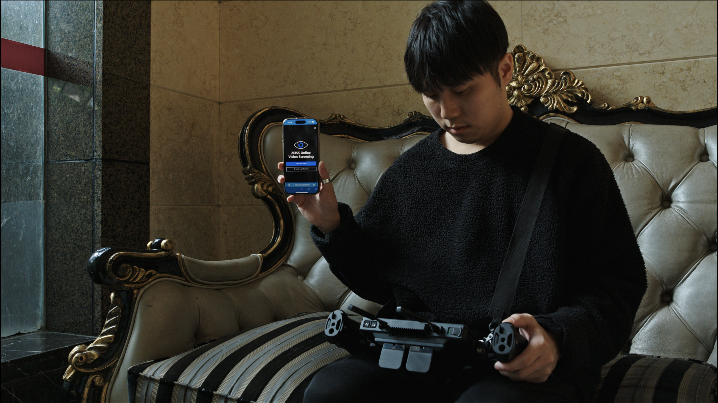
And so this is why any vision test will require you view a chart at a specified distance. It’s to recreate standard conditions before they plot and evaluate your eyesight. You can see what kind of conditions Zeiss has for their vision test on their website for free. Whether you can perceive the dimensionality of an image is largely determined by conditions such as how far away you are from the monitor, the angle or view, or size of the projection. So consider this factor next time you judge image quality. In the world of image quality the real world is irrelevant. The only thing that is real is our cognition.

Bokeh
Bokeh balls from highlight sources
Probably the most subjective territory of image quality is image blur. Bokeh describes out-of-focus areas particularly when they are blurry or defocused. One can generally say it creates an attractive separation with the background or foreground. There are many words that are used to describe the aesthetic qualities of bokeh including ‘creamy’ and ‘painterly’. However bokeh traits are highly variable and dependent on aperture, distance and focal length, making what is at its core a situational phenomenon even more inconsistent to define. How fitting that the word originally comes from the Japanese root ‘boke’, which translates to confused, dizzy, hazy, blur.

The optical reason for bokeh is when a lens is defocused and light rays overlap in an intersecting circle of confusion, rendering a blurry image. The most prominent bokeh balls are usually objects that are brightest, which illustrate that this blurry phenomenon is particularly related to highlights. There are some technical aspects that can notably affect bokeh including the sagittal and tangential relationship, number of iris blades or over/under-corrective elements. We’ve also established that the type of blur before and behind the focal point is different. But we will focus on aesthetic qualities we can safely describe instead, as this is the main characteristic that matters to image makers.
Common Bokeh Qualifiers (Creamy, Dreamy, Painterly)
Bokeh is quite difficult to define, typically least distracting when there are not many artifacts and polygonal shapes. Let’s start off with the most common buzzwords of creamy, dreamy and painterly.
Creamy simply refers to the smoothness of the bokeh. This is not as universally adored as you may think as some observers could find the smoothness nauseating. If you don’t like this look, you’d probably use the words greasy or smeary to describe it.
Dreamy implies softer contrast and sharpness to evoke a hazy dream-like trance.
Painterly suggests that the bokeh looks like a painting.
impasto texture
painterly brushstroke texture
This is where criticism is warranted as there are many styles of painting including water colors, brush, pastel, oil and so on. Art is already so subjective; what I consider painterly might be different than your interpretation of it. It’d be like if I wanted to introduce an attractive person to you; that could be Mama Ghost or Sydney Sweeney. But consider if I were to describe the person as sexy, beautiful or cute, you’d probably have a better idea what kind of person we’re talking about here. At the very least, you should have a decent concept of what this person doesn’t look like. And if that doesn’t satisfy you, consider how in music, a major chord may sound happy or strong while a minor chord may sound sad or weak. Although the context of other chords can influence its feeling, this is generally an acceptable descriptor even when it’s possible for a song to be interpreted as both sad and happy by different people.
The definition of painterly is “(of a painting or its style) characterized by qualities of colour, stroke, and texture rather than of line.” A quick google search and you’ll indeed see many colorful paintings ranging from the texture of artistic brush strokes to oil, or impasto. Painterly may not be a precise term, but at least it’s more specific than ‘nice bokeh’. It’s a general word for describing something artistic.
Resembling that of surrealist impressionism (oil)
Resembling that of brush strokes
Smoothness vs. Texture
Bokeh can appear smooth or busy. Creamy, buttery, silky, velvety all suggest that the bokeh is smooth with no abrupt transitions. It’s the level of uniformity and evenness that separates it from the ‘fuzziness’ of textured bokeh. ‘Busy’ bokeh can refer to any artifacts or textures like onion ringing, haloing, soap bubble, donut or nisen bokeh. I’m not a huge fan of the last term as it isn’t immediately obvious what it constitutes.

DZOFilm Arles 21mm T1.4
Nisen is a term for a fuzzy blur as a result of having double lines that create a nervous after image effect. But this texture could still resemble painterly brushstrokes, which is actually how DZOFilm characterizes the rendering of the Arles. It’s up to you to judge if it’s one of those misleading marketing terms designed to portray a defect as something attractive, but character isn’t always unintentionally designed. Smooth bokeh is less distracting for video, but there are many reasons to enjoy textured bokeh, such as to enhance the artistic aesthetic for photos.
High vs Low Contrast


Bokeh can have high contrast or low contrast. High contrast bokeh means more defined edges and lines, which is generally undesirable as this makes the bokeh more distracting and harsh. Low contrast bokeh can then be described as soft, causing blurred objects to overlap and blend with each other. For this reason, soft bokeh could also be considered ‘painterly’ for its resemblance to surrealist oil paintings. This is accomplished by how it enlarges the thickness of lines to feather out the edges of an object, creating an abstract smoothening for the background, which also contributes to the ‘creamy’ description. It may heavily be influenced by the amount of blur rather than type of blur.


Out-Of-Focus Transition
Fluid changes in bokeh
Abrupt changes in bokeh
Gradual sections of bokeh
Abrupt sections of bokeh
The transition from sharpness to blur can be gradual, abrupt, dramatic, or in sections. Generally an unnoticeable transition feels most natural when you don’t notice peripheral out-of-focus areas. This could be accomplished through bokeh gradually disappearing into the background, quickly but feathered out smoothly so that you can’t easily identify where. Other stills lenses may have abrupt sections, where things are in focus until they’re not, though photographers may find this sharpness across the entire plane to be favorable for portrait shots. People complain when only one eye is in focus even in cinematography.
Notice the seamless transition to out of focus areas from the knuckles to the wrist.
Shape
Bokeh balls are highly influenced by highlights and can have many shapes and patterns not limited to round, polygonal, cat’s eye, ninja star, lemon shaped, swirly, waterfall. These traits are not exclusive to an optical design and can vary situation to situation for the same lens.
Round bokeh
Lemon bokeh
Oval bokeh
Polygonal bokeh
Soap bubble bokeh
Ninja star bokeh
Cat’s eye bokeh
Swirly bokeh
Creamy bokeh
Average bokeh

Waterfall bokeh emulation
Color and Brightness
Bokeh can have color fringing. The bokeh of objects with higher brightness will generally be more prominent.

Motion Cadence
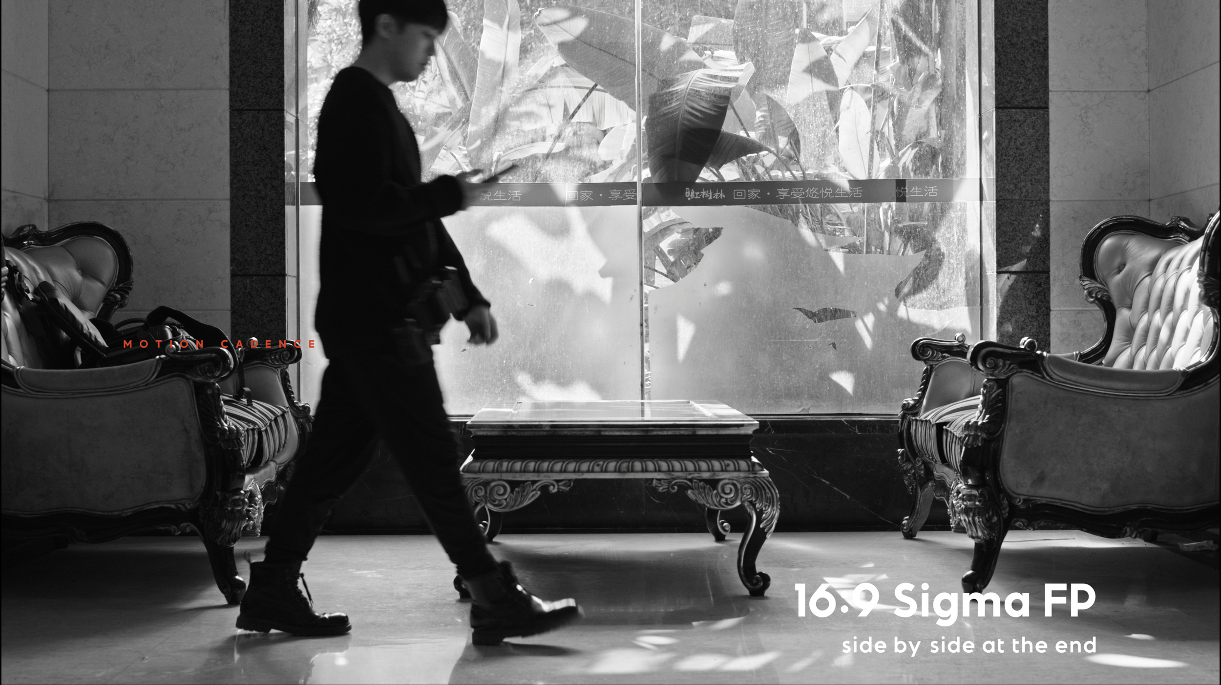
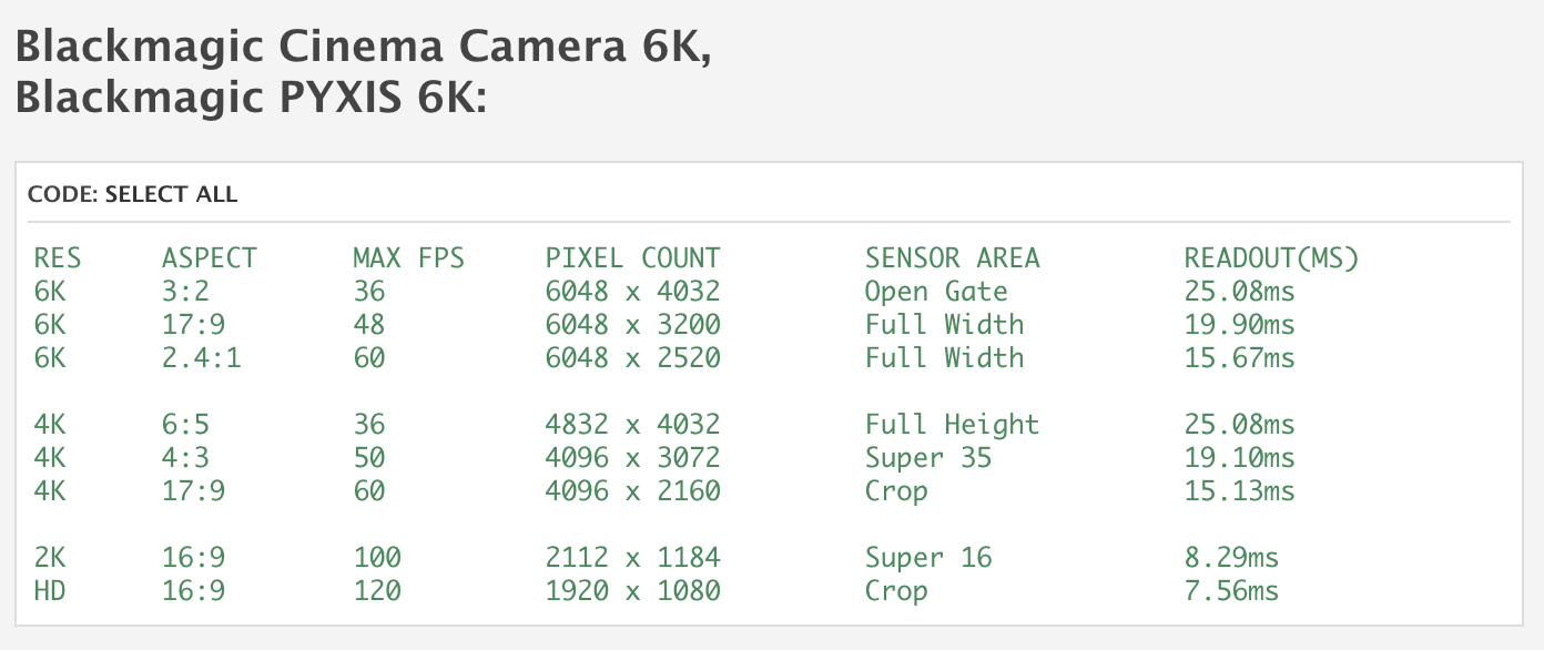
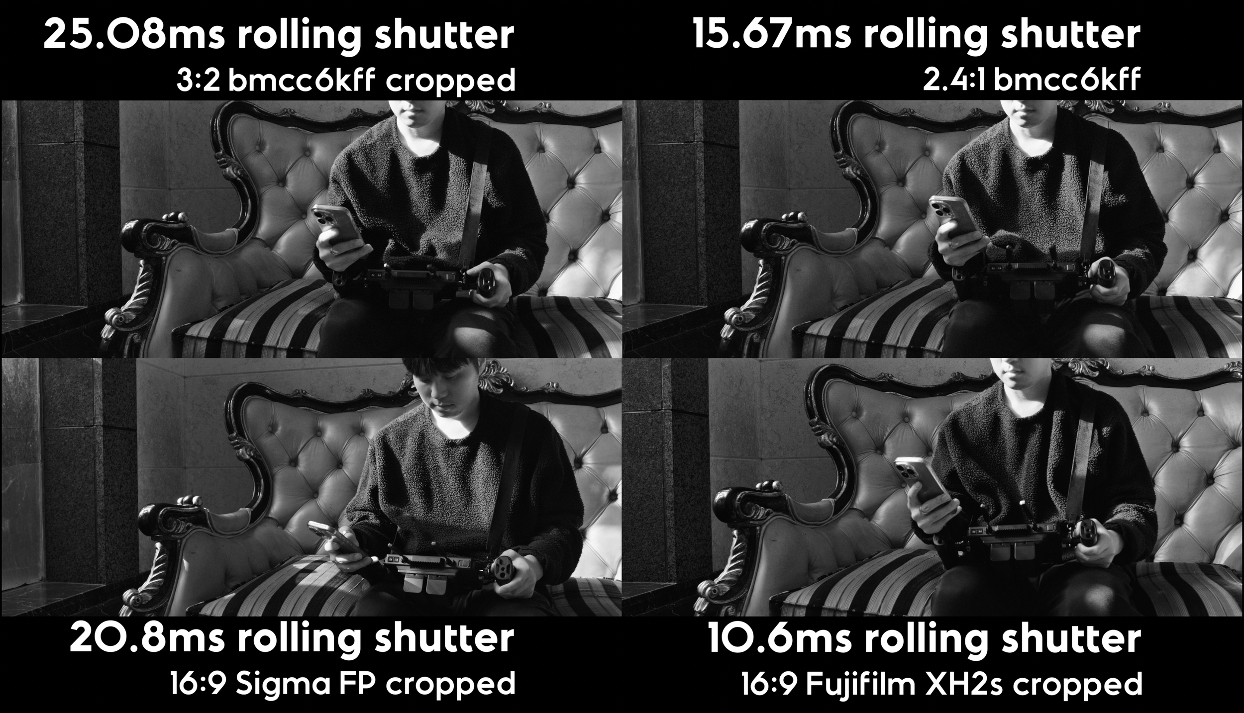
There are some cinematographers that believe motion feels different for certain cinema cameras. It’s unclear to me whether good motion cadence refers to smooth playback or the choppiness of analog. People generally favor movement from global shutter cameras, so perhaps rolling shutter or motion blur could explain poor motion cadence. It could also theoretically lie in how the camera calculates 23.976 frames per each second, as cameras don’t actually record fractions of a frame. In doing this test, I’ll test each hypothesis with different cameras and aspect ratios, because on the BMCC6kFF rolling shutter changes from 15ms to 25ms based on aspect ratio.
Is it the rolling shutter, motion blur, or none of these? And which is better? I’ll let you judge. (See the motion cadence section on YouTube/Vimeo)

Organic

The term ‘organic’ came to be as a response to the rise of digital images. Some find the pristine reproduction of modern sensors to be unappealing. Although digital sensors may actually be more realistic, it’s often perceived as strangely less natural to the decades of images created on film we’ve become accustomed to. This is why absolute micro contrast, pop or exacting realism is not the key to unlocking cinema. It is but one lego in your cinematic tool kit. Human optics seem to perceive at least 30 to 60 frames per second, but most people would prefer to watch films around 24 fps. This reveals that in seeking 'organic’ looking images, we ultimately refer to pictures resembling celluloid film. But what constitutes the film look?

Now we’re getting into pitchfork territory. Some people argue there are certain qualities we may associate with film including the random gaussian patterns of grain, varying distribution of sharpness or highlight roll off. Whatever the secrets of film emulation, it’s not my forte nor domain. There are many bigger authorities on this subject matter, probably trying to sell you a film emulation. All you need to know is that filmic images are not necessarily photo realistic. It’ll always about the feeling that images evoke from us, which gives them purpose.
Final Remarks

There is more to image quality than numbers…which might sound weird when I spent so much time analyzing graphs just to disprove its value on aesthetics. The skillset that allows you to process numbers so scientifically is not exactly complementary for the artistic sensibilities required for making better visuals. You similarly don’t need to know music theory in order to make great music, even though it can help. So I’m not concluding it’s useless, rather expressing caution that it can get in the way. Math doesn’t always make you see more, sometimes it makes you experience less.
Take a look at this table of the medals won by each country in the 2008 Olympics. Based on the medals, which country won?


You could argue America won because they had the higher overall medal count, or if you look at gold medals, you could claim China won because they have more 1st places. How can the same source of data suggest 2 different winners? Could it be both countries won? Or maybe data isn’t a divine truth and is susceptible to error, bias, extrapolation, false correlations and most importantly: interpretation.
Some things in life are subjective at its core, that doesn’t make it any less real. A lot of content creators short sightedly think the only truth is reducing cinema to pixels and spreadsheets, but those people like the idea of filmmaking more than making films. That’s why you can’t moneyball your way into cinema because numbers can’t fully explain everything. And even if it could, it is ultimately feel, not specs, that allows us to tell creative stories.
So what is image quality, really? Take a look at the diverse landscape of cinema. There’s never been one answer, because image quality is not a science. Image quality is taste. Image quality is you.

Error and Uncertainties
This content is intended to explore rather than be a technical confirmation and is catered toward those that are intellectually curious for creative application. If you do want to cite something here, please note that there will always be some error. For some camera tests, the sensor of the Blackmagic protrudes forward more than the other cameras when mounted to the same point. Some cameras are taller, but I also didn’t line them up perfectly. This led to some differences in perspective, but it also appears as though there’s a difference in DOF. My lenses use electronic communication and I set the f stop in camera, but it appears it was more than a minor shift, perhaps it’s the lens adapter or camera. For Fujifilm, I used a speed booster to match DOF to the full frame sensors and for native glass I adjusted aperture accordingly to equalize DOF. The contrast ratios are also different among cameras so you will be at the mercy of my judgement for matching exposure, color was not touched and used the same Rec709 conversion. Also this file was 420GB, which is above the limit for YouTube uploads so I had to compromise. I did some testing and found 4K ProRes to be better than 6K h265, but bear in mind the BMCC6K comparisons will look vaguely less sharp.

References
Achtel, Pawel. “MTF Camera Comparison – Achtel.com.” Achtel.com, 10 Dec. 2024, achtel.com/mtf-camera-comparison/. Accessed 5 Mar. 2025.
Ballmann, Stefan. “How Does ZEISS Define Bokeh – an Interview with Dr. Stefan Ballmann.” Lenspire Zeiss, Zeiss, 11 Apr. 2017, lenspire.zeiss.com/photo/en/article/how-does-zeiss-define-bokeh-an-interview-with-dr-stefan-ballmann. Accessed 4 Jan. 2025.
Blahnik, Vladan. “About the Irridance and Apertures of Camera Lenses.” Lenspire Zeiss, Zeiss, July 2014, lenspire.zeiss.com/photo/app/uploads/2022/02/technical-article-about-the-irradiance-and-apertures-of-camera-lenses.pdf.
Chambers, Lloyd. “Micro Contrast and the ZEISS “Pop” – by Lloyd Chambers.” Lenspire Zeiss, Zeiss, 29 Aug. 2017, lenspire.zeiss.com/photo/en/article/micro-contrast-and-the-zeiss-pop-by-lloyd-chambers. Accessed 4 Jan. 2025.
“History in the Making – the Origins of the ZEISS Otus Lens Family.” Lenspire Zeiss, Zeiss, 29 May 2018, lenspire.zeiss.com/photo/en/article/the-unique-history-of-the-otus-lens-family-zeiss. Accessed 4 Jan. 2025.
Hönlinger, B, and Hubert Nasse. “Distortion.” Zeiss, 2009.
Imatest. “Acutance and SQF (Subjective Quality Factor) | Imatest.” Imatest.com, Digital Image Quality Testing, 2020, www.imatest.com/docs/acutance/. Accessed 8 Feb. 2025.
---. “MTF Curves and Image Appearance | Imatest.” Imatest.com, Digital Image Quality Testing, 2020, www.imatest.com/imaging/mtf_appearance/.
“Introduction to Modulation Transfer Function.” Edmundoptics.es, 2023, www.edmundoptics.es/knowledge-center/application-notes/optics/introduction-to-modulation-transfer-function/. Accessed 4 Jan. 2025.
Kitaoka, Akiyoshi. “Chromostereopsis.” Encyclopedia of Color Science and Technology, 2015, pp. 1–13. Springer Science+Business Media, www.psy.ritsumei.ac.jp/akitaoka/Kitaoka2015_ReferenceWorkEntry_Chromostereopsis.pdf, https://doi.org/10.1007/978-3-642-27851-8_210-1. Accessed 8 Feb. 2025.
Koolen, Ruud. “On Visually-Grounded Reference Production: Testing the Effects of Perceptual Grouping and 2D/3D Presentation Mode.” Frontiers in Psychology, vol. 10, 1 Oct. 2019, pmc.ncbi.nlm.nih.gov/articles/PMC6781859/, https://doi.org/10.3389/fpsyg.2019.02247. Accessed 3 Dec. 2022.
Nasim Mansurov. “How to Read MTF Charts.” Photography Life, 20 Apr. 2013, photographylife.com/how-to-read-mtf-charts. Accessed 4 Jan. 2025.
Nasse, Hubert. “Depth of Field and Bokeh.” Zeiss, Mar. 2010.
---. “How to Read MTF Curves.” Zeiss, 2008.
---. “How to Read MTF Curves? Part II.” Zeiss, 2009.
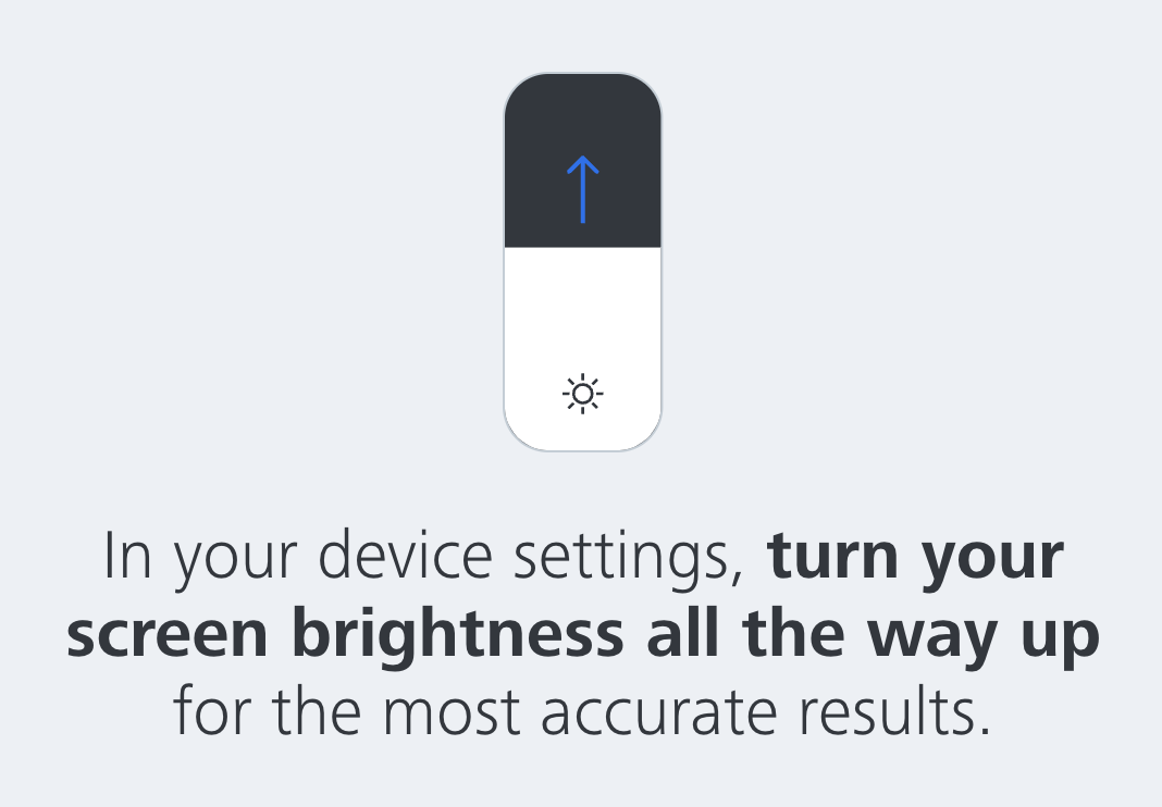
“Vision Screening.” Zeiss.com, Zeiss, 2022, www.zeiss.com/vision-care/us/eye-health-and-care/vision-screening.html.
Recommendations


1 stop away from greatness.